


Mockup Creator Pro
3.861.00 Reviews
App Specs
- Version
- 17
- Updated On
- License
- Free
- Downloads
- 10,000+
- Developer
- Onion Tavern
- Categories
- Art & Design
- Platform
- Android
Screenshots
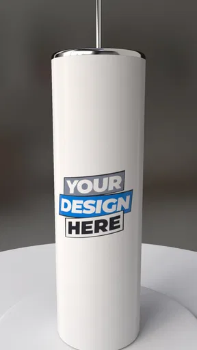
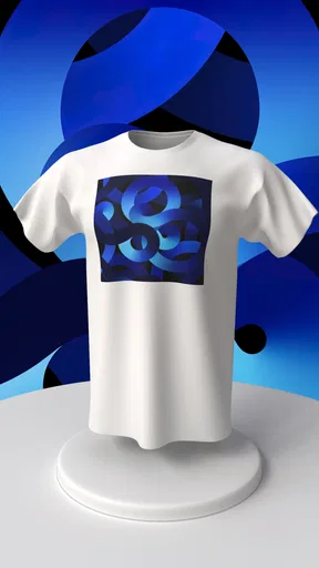
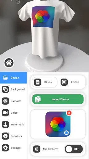
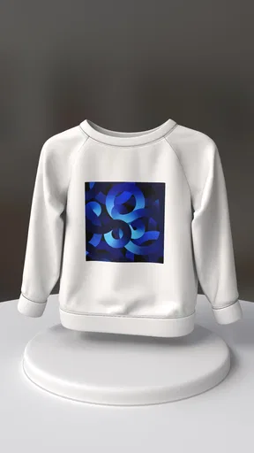
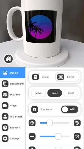
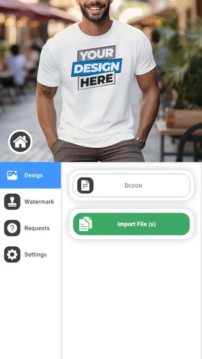
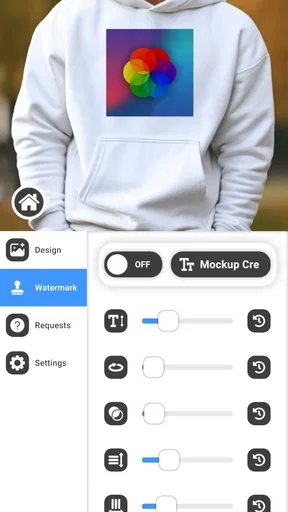
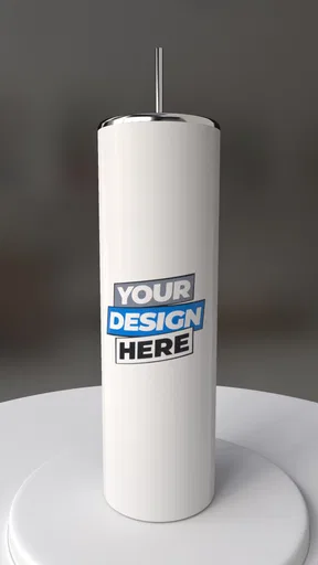
 Analysis by AppCompare
When I need to turn a flat product idea into something that looks ready for a presentation, a shop page, or a social post, I usually want a faster route than building a complete scene in a desktop 3D program. That is the space where Mockup Creator Pro makes sense. It is a free Art & Design app from Onion Tavern, focused on creating three-dimensional product mockups rather than acting as a full illustration or modeling studio.
My first impression is that it is aimed at people who already know what they want to show, but do not want to spend an afternoon constructing every visual element from scratch. The app is useful when the product image is the message: a package, device, label, cover, or other designed object placed in a more convincing 3D presentation. It feels more like a practical presentation tool than a broad creative playground.
That distinction matters. If you are looking for freehand drawing, photo retouching, animation, or advanced 3D modeling, this is probably not the right starting point. If your everyday problem is “I have a design, but it still looks flat,” the workflow is much more relevant.
From a flat design to a usable mockup
I find it useful to decide what a mockup needs to prove before I start shaping the presentation: whether the question is about the product’s overall form, the placement of its label, or simply whether the design reads clearly at a glance. That keeps the first version focused and makes feedback more actionable. Once the goal is clear, the next challenge is judging how much visual polish the design actually needs.
The starting condition: knowing what needs to be shown
The best results begin before opening the app. I would first decide what the mockup needs to communicate: the front of a package, the shape of a product, a new label, or a concept that needs approval. That small decision prevents the common mistake of adding 3D treatment simply because it is available.
For example, imagine I have prepared a label for a small food brand and need to send it to a client. A plain image may prove that the artwork exists, but it does not help the client picture the finished object. A mockup can bridge that gap. I can use the design as the visual starting point, shape the presentation around the intended product, and produce something easier to discuss.
I also find it helpful to prepare the source artwork with clean edges and readable typography. A mockup can add depth and perspective, but it cannot repair a badly cropped logo or text that is too small to survive a change in angle. This is one of the less obvious lessons with tools like this: the quality of the input often matters more than the final decorative treatment.
Worth Reading Before You Choose
EA SPORTS FC Mobile 26 Is a Bigger Football Game, but It Takes Time
Flipboard Shows What News Apps Must Do Beyond the Feed

Switching to Android Auto Means Rethinking Your Driving Routine
Google Calendar Makes a Crowded Week Easier to Manage

Ludo King Makes the Most of the Minutes Between Plans

Baby Panda World Brings Quick Play to Modern Phones, but Its Game Library Feels Busy
The app is available at no cost, which makes it easy to test without committing money at the beginning. There are optional purchases ranging from $7.99 to $32.99 per item, so I would treat the free starting point as an evaluation stage rather than assuming every possible capability is included without payment.
Building the first version
Once I have a clear visual goal, I approach the app as a sequence of decisions rather than a single “make it look professional” button. I start with the object or presentation style that is closest to my intended outcome. The important thing is to judge the design while it is being shown in space, because a graphic that looks balanced on a flat canvas may become crowded when wrapped, tilted, or viewed from an angle.
I pay particular attention to the main face of the object. If that area carries the brand name or product title, I keep it facing the viewer and avoid letting perspective become a distraction. For a concept presentation, a slight angle can make the object feel more tangible. For a sales image, clarity usually matters more than drama.
This is where the app’s three-dimensional focus is most useful. Instead of asking a client to imagine how a flat label might appear on a product, I can show a closer approximation of the final presentation. That reduces explanation and makes feedback more concrete. A reviewer can comment on visibility, hierarchy, and placement while looking at something that resembles an actual object.
One workflow tip I would recommend is creating a deliberately simple first pass. I place the design, check the proportions, and inspect the most important text before spending time on visual polish. If the artwork is already awkward at this stage, extra effects will only make the problem harder to notice. The quick draft is not wasted work; it is a way to catch structural mistakes early.
Making the scene serve the design
A convincing mockup is not automatically a useful mockup. I try to keep the scene subordinate to the product. When the angle, depth, or surrounding treatment becomes more noticeable than the artwork itself, the image stops helping the viewer understand the design.
For a presentation to a client, I would create one straightforward view first, then consider a second view only if it answers a different question. One image might establish the overall shape, while another could show how the design continues around a side or edge. This is more effective than producing several nearly identical versions that make comparison difficult.
Another practical insight is to separate approval stages. I use the first mockup to confirm the design and placement, not to win an argument about final visual style. Once the client accepts the basic direction, I can refine the presentation. This handoff keeps the conversation focused and avoids revising a polished scene when the underlying artwork is still changing.
Because the app is specialized, I would not expect it to replace a complete design pipeline. I would prepare the artwork in the tool I already trust, use Mockup Creator Pro to present it in 3D, and then move the resulting image into the place where it will actually be shared. That division of labor is one of its strengths: it can occupy the middle of a workflow without pretending to be every tool at once.
The handoff from creator to client or audience
The most valuable outcome is often not the image itself but the smoother handoff it enables. A designer can send a mockup to a client, a small business owner can show a product concept to a partner, or a student can present a packaging idea with more context than a flat rectangle provides.
Before sharing, I would inspect the image at the size the recipient will actually see. A detailed mockup viewed on a large screen may become less useful in a small chat preview. Important text should remain legible, and the object should be recognizable without a long explanation. This is especially important when the recipient is not a designer and may judge the image quickly.
I also prefer to label versions clearly outside the app when a project is moving through revisions. A mockup is persuasive, which means people may remember the presentation more strongly than the underlying file. Keeping the design version and the visual version aligned prevents an avoidable handoff problem: approving an attractive image that no longer matches the current artwork.
For freelancers, this can make a review meeting more efficient. Instead of discussing abstract placement, I can ask whether the logo feels too low on the package or whether the front panel needs more breathing room. Those are specific questions, and the 3D context helps everyone answer them with less guesswork.
What the finished result does well
In my view, the app’s strongest role is rapid visual communication. It helps transform an idea from “this is the artwork” into “this is how the artwork might live on an object.” That extra layer is valuable for product concepts, packaging proposals, promotional previews, and portfolio pieces that need more presence than a raw design file.
It is also approachable for people who are not ready to learn a full 3D package. Traditional 3D software can offer far more control, but that control comes with a steeper learning curve and more decisions about modeling, materials, lighting, cameras, and rendering. A focused mockup app can be the better choice when the goal is a presentable result rather than technical ownership of every part of the scene.
The app has a 3.8 average from over 400 ratings and has passed 10 thousand installs, which suggests a modest but real user base. I would read those figures as a reason to take it seriously as a practical niche tool, not as proof that it will suit every design workflow. Its appeal depends heavily on whether your projects match its product-mockup focus.
On the device side, the app supports Android 8.0 and later, and its current version is 17. That makes it accessible to many older Android devices, although the experience will still depend on the phone or tablet being comfortable with visual work. I prefer using a larger screen when judging perspective and typography, because small displays make it easier to miss distortion or alignment problems.
Where the workflow breaks
The first limitation is scope. I would skip this app if I needed detailed object modeling, complex lighting control, a complete brand-design environment, or a replacement for professional desktop production software. Its value comes from shortening a specific path, not from covering every stage of visual creation.
The second limitation is that 3D presentation can create false confidence. A mockup may look polished while still being unsuitable for manufacturing, printing, or final product photography. I would never use the rendered presentation as a substitute for checking the actual production template, color requirements, bleed, dimensions, or physical materials. The app can help sell an idea, but it does not turn a concept image into a manufacturing specification.
There is also a judgment call around realism. Too little depth makes the result feel like a flat graphic with decoration. Too much perspective can bend text and weaken the design. I find that the safest approach is to protect the information hierarchy first: product name, brand mark, and key message should remain easy to read even if the viewer ignores the 3D effect.
The optional purchase range is another factor to consider. Since the app is free to start but includes items priced from $7.99 to $32.99, I would test the workflow on a real project before buying anything. That is particularly important for occasional users who only need one mockup every few months. Frequent creators may find paid options worthwhile if they save repeated setup time, but casual users should first confirm that the available process matches their needs.
Some people may also prefer a browser-based mockup service. Those alternatives can be convenient when working across devices or collaborating with a team, while an Android app may feel more personal and direct for mobile-first work. On the other hand, a full desktop application is usually better when precision, file management, and repeatable production matter more than speed. I see this app between those choices: more focused than a general design editor, but less comprehensive than a professional 3D or desktop mockup workflow.
Who I would recommend it to
I would recommend it to an independent designer who needs quick presentation images, a small business owner testing packaging ideas, or a student learning how product graphics change when placed into a three-dimensional context. It is also a sensible option for someone who receives flat artwork from another person and needs a clearer way to present it to a client or team.
I would be more cautious recommending it to a production designer who needs exact technical output, or to an illustrator who wants to draw and paint inside the same application. Those users may spend more time working around the app’s focused purpose than benefiting from it. A desktop tool or a broader design app would likely be a better long-term home for their work.
For a realistic everyday scenario, imagine preparing a new label before a short meeting. I would import or arrange the artwork, create a restrained 3D presentation, check the front-facing view for readability, and share that version for feedback. If the client asks for a higher logo position, I would return to the source artwork, update it, and repeat the mockup step rather than treating the scene as the place where all design changes should happen. That workflow keeps revisions clean and makes the app useful without forcing it to become the center of the entire project.
My practical verdict
Mockup Creator Pro is a focused free app for Android users who want to present product artwork with more depth and context. I like it most when I treat it as a bridge between a finished flat design and a persuasive visual preview. The app earns its place by reducing the distance between an idea and something a client or audience can immediately understand.
I would approach it with realistic expectations. It is not the tool I would choose for advanced modeling, manufacturing accuracy, or a complete creative pipeline. It is the tool I would open when the design is ready enough to show, but still needs a believable product setting. The free entry point makes experimentation easy, while the in-app purchase range means I would check the actual workflow carefully before spending money.
My recommendation is simple: if your main question is “How will this design look as a product?” it is worth trying. Start with one real project, keep the first scene uncomplicated, inspect the important text at the final sharing size, and use the result to guide feedback rather than replace your original design files. Used that way, Mockup Creator Pro is a practical presentation step, and its biggest strength is helping a flat concept become easier for other people to see, discuss, and approve.
Pros
- Creates polished app and device mockups for presentations.
- Offers reusable templates that speed up design workflows.
- Supports visual previews before sharing or publishing designs.
- Useful for marketers
- developers
- and freelance designers.
- Exports makeups suitable for portfolios and promotional materials.
Cons
- Some advanced templates or tools may require a paid upgrade.
- Large mockup files can use considerable device storage.
- Editing options may feel limited for highly customized scenes.
- Export quality and formats may vary between available templates.
- Beginners may need time to learn the interface and workflow.
FAQs for Mockup Creator Pro
What is Mockup Creator Pro used for?
Mockup Creator Pro is designed to help users create polished visual mockups for apps, websites, products, branding materials, and promotional content. It can be useful for presenting a design inside a phone, tablet, computer, packaging, or other realistic setting. In my experience, the app is mainly aimed at designers, marketers, developers, students, and small businesses that need presentable visuals without building every scene from scratch.
Is Mockup Creator Pro suitable for beginners without design experience?
Yes, the app can be approachable for beginners because mockup creation generally relies on ready-made layouts, image placement, editing controls, and export options rather than advanced graphic-design techniques. However, users who want highly customized results may need time to understand layers, sizing, alignment, backgrounds, and perspective adjustments. A little experimentation is worthwhile, especially if you want your final mockups to look professional rather than simply using the default template settings.
What types of mockups can be created with Mockup Creator Pro?
Mockup Creator Pro may support a variety of presentation formats, depending on the version and available template library. Typical possibilities include smartphone and tablet screens, desktop displays, product packaging, social media graphics, promotional images, and branding presentations. Before downloading, it is sensible to check the current store listing and screenshots, because the available devices, scenes, templates, and editing tools can change through updates or differ between Android and iOS versions.
Does Mockup Creator Pro require payment or include in-app purchases?
The cost structure can vary by platform, region, and app version. Some features or template collections may be available for free, while advanced exports, premium scenes, watermark removal, or additional design resources may require a purchase or subscription. I recommend checking the official Google Play or App Store listing before installing and reviewing the payment details carefully. Also verify whether a trial automatically changes into a paid subscription.
Can mockups created in Mockup Creator Pro be exported and shared professionally?
The app is intended for creating visuals that can be saved or shared, but the exact export formats, image resolution, watermark policy, and sharing options should be confirmed in the current version. For casual posts, previews, portfolios, and presentations, standard image exports may be sufficient. If you need files for printing, client delivery, advertising, or commercial use, check whether high-resolution exports are available and read the app’s licensing terms before relying on it for professional projects.


